

Day Care patients commission painting for newly refurbished St Elizabeth Hospice
A local artist has created a painting for St Elizabeth Hospice which has just been unveiled at the day unit.
Day Care patients at St Elizabeth Hospice were happy to accept a commissioned Oil painting entitled: ‘Apples at Dallinghoo”, from Wendy Parkes as a result of a joint project organised in the autumn of last year before a major refurbishment of the Hospice.
Wendy, who lives in Witnesham, is studying for a Fine Art Diploma at the Art Academy, an independent art school based at Borough, London. She attended afternoon Day Care sessions at the Hospice in Foxhall Road, Ipswich, on Fridays for eight weeks, engaging with patients and discussing subjects, sizes, themes and colours for the 160cm x 60cm oil painting.
Wendy reported to the patients every week, showing preparatory drawings, rough colour sketches and ink studies, with the help of David Hardy, the Hospice’s art therapist.
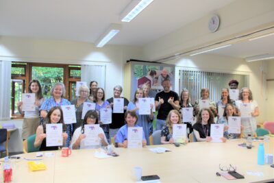
Pictured below: Hospice Executive Assistant Sue Tunaley, Hospice Chief Executive Jane Petit, Hospice Day Unit Manager Helen Finlinson, Hospice Art Therapist David Hardy and artist Wendy Parkes at the unveiling of “Apples at Dallinghoo”.
Wendy said: “A college project required a ‘commissioned’ painting. Having opened my garden to raise money for the Hospice, a link was made, and as my subjects tend to be inspired from produce grown in the garden and views from the surrounding countryside, this painting has brought the countryside into the Hospice! A friend in Dallinghoo had an enormous crop of bright red apples last autumn. At the same time, my mother was taking part in the W.I. Suffolk orchard survey, to encourage awareness about the conservation and planting of fruit trees. It seemed appropriate to continue the ‘apples’ theme.
“The composition needed to fit a particularly wide and narrow space, so a frieze-like format was chosen to avoid switches for medical equipment that were high on the walls.
“It became clear that the patients, especially those with deteriorating eyesight, reacted positively to bright colours, especially reds. It is for this reason that I chose a light palette of yellows, reds and greens which have the effect of brightening a dark wall.
“It was evident, too, that the subject needed to be easy to interpret and that a clear figurative style was necessary. The patients preferred to recognise familiar shapes. My current work has a more abstracted quality than that in ‘Apples at Dallinghoo’, which clearly shows boughs of apple trees laden with fruit, but in this commission anything too abstract became confusing. I learned a great deal from the discipline of having to prepare something interesting to show and talk about at every session and I really enjoyed the interaction with the patients and the nurses, all of whom had useful contributions to make to the final result.”